|
|
Wednesday, June 22, 2011
Continuing our "sneak peek" series into the next version of FeedBlitz - aka v4 - this post is about how v4 takes the opportunity to add more dashboards and metrics.
The "always on" navigation I mentioned last time enables more opportunities to provide meaningful insight into your subscribers at more opportunities. Beyond that, we've simplified the "in screen" navigation and replaced the cascading series of menus with clear, simple, task-centric buttons.
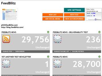
There are new site dashboards and multi-site summaries. We've added site thumbnails, audience metrics and Alexa rankings.
Within each site, you can see at a glance how your audience divides between the different social media channels, email and RSS. You can quickly see what's growing and what's not, essential data for the modern social media blogger and marketers.

Text in the lower dark bar is clickable, taking you directly to the applicable option for that widget.
Also note that we've tried making the screens more useful. There are no intermediate menus any more; clicking on a feed or a list gets you real data right away.
Next time, I'll drill into the mailing list area, to talk about the new capabilities and ease of use changes there.


The "always on" navigation I mentioned last time enables more opportunities to provide meaningful insight into your subscribers at more opportunities. Beyond that, we've simplified the "in screen" navigation and replaced the cascading series of menus with clear, simple, task-centric buttons.
 The Main Pane: Delivering the Goods
There are new site dashboards and multi-site summaries. We've added site thumbnails, audience metrics and Alexa rankings.Within each site, you can see at a glance how your audience divides between the different social media channels, email and RSS. You can quickly see what's growing and what's not, essential data for the modern social media blogger and marketers.
Major task: The green button
At each level, the big green button upper right takes you to the main task for that screen or element. The green button always represents the most valuable sub screen at that point in the navigation. So, for example, at the site level the most important task is editing the settings for the site itself. At the mailing list level, it's sending a mailing.Other tasks: Orange buttons
The orange buttons represent other significant tasks you can do. Yet more options are available in the rest of the screen or any displayed widgets.Widgets
At many places in v4 you will find screen elements called widgets, like this one from an RSS feed:
Text in the lower dark bar is clickable, taking you directly to the applicable option for that widget.
Also note that we've tried making the screens more useful. There are no intermediate menus any more; clicking on a feed or a list gets you real data right away.
Next time, I'll drill into the mailing list area, to talk about the new capabilities and ease of use changes there.
|
|


4 Comments:
Ok. so when is v4 active? Seems like it has been coming forever.
All will havce access to it next month!
Hi Phil, when does v4 go live? It's 7/22 and I don't see it yet? thanks.
The link to fire v4 up is at the end of the v4 intro video - http://blog.feedblitz.com/2011/07/watch-feedblitz-v4-intro-video-now.html
I also tweeted it, so do follow me over on Twitter as @phollows!
Thanks
Phil
Post a Comment
Note: Only a member of this blog may post a comment.
<< Home