|
|
Tuesday, June 14, 2011
A day later than promised, here's the first post in our countdown to the brand new FeedBlitz user web site. As I've mentioned before, we took on the challenge of making a great (but fairly complex) service more approachable by a wider group of people, bloggers and companies.
Put another way, the goal is to make it easier and faster for you to:
No more tabs. No more hunt and peck to find what you need. No more working through page after page to find where you need to go.
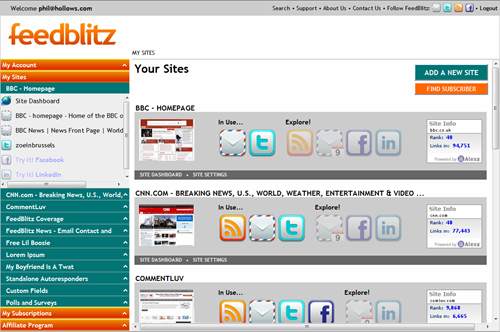
All your navigation is now in the left side bar, available all the time. Click the orange and green to open up each section; click on the titles for the relevant dashboard or the individual entry to work with that element.
All wrapped in a more contemporary look and feel with a dash of added drama.
And that's how the new UI works. It organizes FeedBlitz elements the way you naturally think about them: By site. Open the site you want in the navigation and everything related to it is right there - nothing more (and nothing less). Easy to find, quick to use. There are dashboards at multiple levels (more on these in a later post), as well as site thumbnails and latest Alexa rankings.
Finally, we've also simplified some of the more complex individual pages. Mailing list settings, for example, are now presented in in english, with simple popups to change your settings right there. Fewer clicks, easier to understand what you're working on.


Put another way, the goal is to make it easier and faster for you to:
- Find where you need to be;
- Do what you need to get done.
Finding Your Way Around
 New Navigation
No more tabs. No more hunt and peck to find what you need. No more working through page after page to find where you need to go.All your navigation is now in the left side bar, available all the time. Click the orange and green to open up each section; click on the titles for the relevant dashboard or the individual entry to work with that element.
All wrapped in a more contemporary look and feel with a dash of added drama.
Sites are the Key
Your content the way you think about it
When you think about your site or your blog, you think about your site or your blog. The "Site" is the intuitive way to arrange related subscriptions and social media, because that's how you think about them.And that's how the new UI works. It organizes FeedBlitz elements the way you naturally think about them: By site. Open the site you want in the navigation and everything related to it is right there - nothing more (and nothing less). Easy to find, quick to use. There are dashboards at multiple levels (more on these in a later post), as well as site thumbnails and latest Alexa rankings.
Finally, we've also simplified some of the more complex individual pages. Mailing list settings, for example, are now presented in in english, with simple popups to change your settings right there. Fewer clicks, easier to understand what you're working on.
Existing features more readily available
The new "always-on" navigation also makes it possible for us to raise the profile of core features you may be under-utilizing or even unaware of. Custom fields and segments, for example (at the bottom of the sites area). Affiliates can jump directly to a client. You can manage your subscriptions much more easily here than before, too. There's also a new "breadcrumb" trail above the main pane and a new "utility bar" across the top.Next up: Dashboards and Widgets
I'll cover these in the next update in a few days. Meanwhile, comments welcome!Labels: FeedBlitz, usability, v4
|
|


1 Comments:
Worth pointing out that the screenshot is from one of my test accounts using public sites. We are not claiming any relationship with (or endorsement by) the BBC or CNN.
Post a Comment
Note: Only a member of this blog may post a comment.
<< Home