|
|
Tuesday, June 08, 2010
Subscriber email marketing updates from FeedBlitz can now become a lot more visually appealing thanks to a new set of custom tags available in the Advanced Template Editor (found at Newsletters / Settings / Advanced Email Template Editor). The new tag, <$BlogBlock$>, lets you define different layouts for multi-post mailings.
Up to this point, all single feed FeedBlitz templates look pretty much the same when you have multiple posts - each post has the same layout as the one that comes before. It's great for visual consistency, but if your subscriber mailings typically contain more than one post it also risks being ho-hum, aesthetically speaking. All that sameness can be a little, well, boring.
 There's a reason that newspapers, magazines, brochures and web sites break up blocks of text with call outs, changing colors and backgrounds. It keeps the brain engaged and, as long as the changes aren't too distracting or jarring, makes the content easier to read and encourages you to read more.
The <$BlogBlock$> tag enables you to do the same thing with automated subscriber mailings built from your blog's feed, and while care is needed in its use, you don't have to be a programmer or rocket scientist to use it either.
How It Works
In the advanced template editor, everything between the <$BlogPosting$> tags is repeated for each post included in the mail. <$BlogBlock$> tags act inside the <$BlogPosting$> section, with the contents between the first pair being used for the first post, the contents between the second pair being used for the second post, and so on. If you have more posts than <$BlogBlock$> pairs defined, FeedBlitz will loop back and start with the first block until it's done. If there aren't enough posts to use all the blocks, the remaining blocks simply don't show up in the email, so you can safely define as many as you like; the extras aren't used.
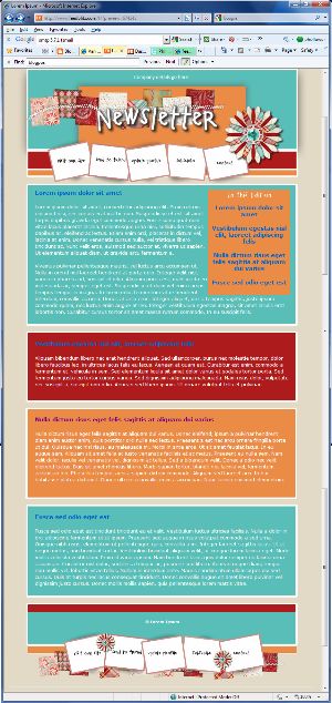
So, as a simple example, say you simply want to change the background color for alternating posts, just like the thumbnail image above. In the Advanced Template Editor (or ATE from now on because it's getting really annoying to type), insert a <$BlogBlock$> tag immediately after your opening <$BlogPosting$> tag, and a corresponding <$BlogBlock$> tag just before the closing <$BlogPosting$> tag. At this point you have one block, not so exciting.
Now copy the contents from the starting <$BlogBlock$> to the closing <$BlogBlock$> (including the <$BlogBlock$> tags themselves). Paste what you copied between the second <$BlogBlock$> and the second <$BlogPosting$>, and voila! A second block. Change the background color for the second block, and then click the preview button.
Alternate posts will have different colors - easy! You can use this approach to change fonts, add borders, whatever you want to do to alternate posts. Here's a live three block example (which has four posts - so the first block (cyan background) is repeated for the 4th entry). It is based on a simple "Lorem Ipsum" test blog.
But you're not limited to just two blocks. You can have three. Or four - or as many as you like.
Changing layout with blocks
Or try this: Make your first block a table, width 100%. Make your second block a table that's 49% wide, floating left. Your third block 49% wide, float right. You'll need to play a little with CSS to get this right but it works great once you do.
Now your top story (the lead) is wide across the whole mail, but stories two and three are in two columns under it. Much more visually interesting! If you typically have more than three stories FeedBlitz will make story 4 wide again (because you only have three blocks), or you can define more narrower blocks to keep the other stories narrow.
More multi-block ideas
Of course, you don't have to make the columns even. You could make the left one (block 2) 60% wide and the right one (block 3) 39% wide, for example, for a slightly asymmetric look. Other uses might include:
Hints and Tips


Up to this point, all single feed FeedBlitz templates look pretty much the same when you have multiple posts - each post has the same layout as the one that comes before. It's great for visual consistency, but if your subscriber mailings typically contain more than one post it also risks being ho-hum, aesthetically speaking. All that sameness can be a little, well, boring.
 There's a reason that newspapers, magazines, brochures and web sites break up blocks of text with call outs, changing colors and backgrounds. It keeps the brain engaged and, as long as the changes aren't too distracting or jarring, makes the content easier to read and encourages you to read more.
The <$BlogBlock$> tag enables you to do the same thing with automated subscriber mailings built from your blog's feed, and while care is needed in its use, you don't have to be a programmer or rocket scientist to use it either.
How It Works
In the advanced template editor, everything between the <$BlogPosting$> tags is repeated for each post included in the mail. <$BlogBlock$> tags act inside the <$BlogPosting$> section, with the contents between the first pair being used for the first post, the contents between the second pair being used for the second post, and so on. If you have more posts than <$BlogBlock$> pairs defined, FeedBlitz will loop back and start with the first block until it's done. If there aren't enough posts to use all the blocks, the remaining blocks simply don't show up in the email, so you can safely define as many as you like; the extras aren't used.
So, as a simple example, say you simply want to change the background color for alternating posts, just like the thumbnail image above. In the Advanced Template Editor (or ATE from now on because it's getting really annoying to type), insert a <$BlogBlock$> tag immediately after your opening <$BlogPosting$> tag, and a corresponding <$BlogBlock$> tag just before the closing <$BlogPosting$> tag. At this point you have one block, not so exciting.
Now copy the contents from the starting <$BlogBlock$> to the closing <$BlogBlock$> (including the <$BlogBlock$> tags themselves). Paste what you copied between the second <$BlogBlock$> and the second <$BlogPosting$>, and voila! A second block. Change the background color for the second block, and then click the preview button.
Alternate posts will have different colors - easy! You can use this approach to change fonts, add borders, whatever you want to do to alternate posts. Here's a live three block example (which has four posts - so the first block (cyan background) is repeated for the 4th entry). It is based on a simple "Lorem Ipsum" test blog.
But you're not limited to just two blocks. You can have three. Or four - or as many as you like.
Changing layout with blocks
Or try this: Make your first block a table, width 100%. Make your second block a table that's 49% wide, floating left. Your third block 49% wide, float right. You'll need to play a little with CSS to get this right but it works great once you do.
Now your top story (the lead) is wide across the whole mail, but stories two and three are in two columns under it. Much more visually interesting! If you typically have more than three stories FeedBlitz will make story 4 wide again (because you only have three blocks), or you can define more narrower blocks to keep the other stories narrow.
More multi-block ideas
Of course, you don't have to make the columns even. You could make the left one (block 2) 60% wide and the right one (block 3) 39% wide, for example, for a slightly asymmetric look. Other uses might include:
- Changing headline positions (alternating left and right justifications, for example)
- Inserting ad sponsorships every Nth article (where N is the number of blocks)
Hints and Tips
- Always make the first block wide if you can - the first block is used to host your subscription form, for example, as well as other subscriber landing pages we serve for you.
- Experiment with a cloned copy of your list so no subscribers will be affected by your work in progress and any goofs you make as you work.
- If you're trying for complex multi-column layouts, get your CSS and HTML right offline in a test HTML file first, then paste it in to the ATE's source view.
- Use the editor's preview button before you save!
- Once you save, send yourself a test sample email via Newsletters / Diagnostics / Test Emails.
- Finally, check your subscription form to ensure that it still looks OK with your new design.
- Get stuck? Contact FeedBlitz technical support and we'll be happy to help.
|
|


0 Comments:
Post a Comment
Note: Only a member of this blog may post a comment.
<< Home