|
|
Friday, March 13, 2009
Back in November 2007 I talked about how we'd improved emails built by truncating content. FeedBlitz kept images in the partial message, even though other services just ripped them out. Pictures are good; we liked that. The emails were better. But it was still only images. Links and other HTML elements were still removed. Better, then, but not perfect.
Today FeedBlitz finished the play.
We're now keeping all safe HTML elements before the cut; including images, links, text changes such as bold and italic fonts, colors, bulleted lists and more. So emails that are truncated are now as rich as their full text equivalents (except that they're, well, not full text).
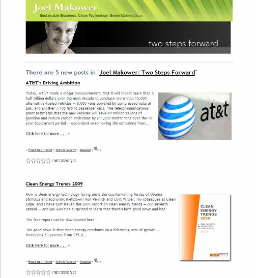
Last time I used Joel Makower's environmental business blog, Two Steps Forward, as an example. Keeping with his blog as our working example, here's how a subscriber email looked before today:

Note that the pictures are present, but there are no links in the body of each post.
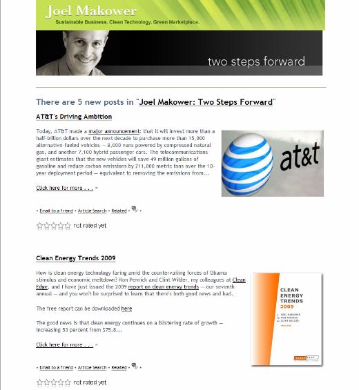
Now, take a look below at what the new feature adds. All the links before the cut-off are present in the abridged text (they're underlined in the screenshot below); links are also placed on the images if they're present that way in the original. If Joel had other formatting above the fold it would appear too:

No confusion for readers (don't you hate it when it says "click here" for something, but the link has been removed and you can't click? No more!). Greater interactivity. More chances to have your readers take an action based on your content, even if you abridge.
Altogether better.


Today FeedBlitz finished the play.
We're now keeping all safe HTML elements before the cut; including images, links, text changes such as bold and italic fonts, colors, bulleted lists and more. So emails that are truncated are now as rich as their full text equivalents (except that they're, well, not full text).
Last time I used Joel Makower's environmental business blog, Two Steps Forward, as an example. Keeping with his blog as our working example, here's how a subscriber email looked before today:

Note that the pictures are present, but there are no links in the body of each post.
Now, take a look below at what the new feature adds. All the links before the cut-off are present in the abridged text (they're underlined in the screenshot below); links are also placed on the images if they're present that way in the original. If Joel had other formatting above the fold it would appear too:

No confusion for readers (don't you hate it when it says "click here" for something, but the link has been removed and you can't click? No more!). Greater interactivity. More chances to have your readers take an action based on your content, even if you abridge.
Altogether better.
Labels: features, Joel Makower, partial feeds
|
|


0 Comments:
Post a Comment
Note: Only a member of this blog may post a comment.
<< Home